Tuesday, 24 January 2012
Thursday, 12 January 2012
Target Audience
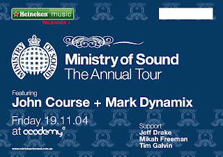
The target audience for the series of A2 posters are dance music lovers with an average age of around 18-30. The venue, Ministry of Sound in London is the most iconic nightclub in the world. Here are some examples of other Ministry of Sound advertising posters.
Briefing In
I downloaded the 2012 D&AD Student Awards Competition Briefs just before Christmas, after narrowing them down to just two I have decided on the Ministry of Sound brief.
For this brief I am required to produce a set of three typographically focused A2 outdoor posters. I am really eager to get started on this project as I enjoy poster design. The posters can either be landscape or portrait and act as a three month advertising campaign for the Ministry of Sound's iconic London event 'Saturday Sessions'
Here is an example of a typographically focused poster for 'Saturday Sessions'
The posters should communicate a clear conceptual theme of idea based on the club or the music, I have been given the Ministry of Sound logo and a colour swatch on the clubs primary advertising colours and so forth. The typography on the posters should strike a balance between expression, experimentation and legibility. Another huge factor I need to think about is that the posters will be often viewed from a moving vehicle so legibility and impact is key.
Subscribe to:
Comments (Atom)


