
Thursday, 29 March 2012
Amended Final Idea
After receiving some critique on my final poster I have decided to move the information from under the Saturday Sessions to the left hand bottom corner in line with the Ministry of Sound logo and the left hand S.

Wednesday, 28 March 2012
Final Idea
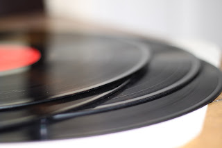
After trying out various backgrounds and backdrops I finalized my choice on a cropped in area of a record.

I stuck with my initial idea bar the extensions on the Y, the idea is based on my research into Swiss typography and using angles. The angles I used are -20 and 28, there is no real relevance to the angles bar the fact that they worked alongside each other and the body copy runs off the angle of the Y extension.
The choice of background is meant to bring back to 'retro' qualities of vinyls and record players, most DJ's of this era use computer software and digital turntables but back when Saturday sessions first started records will of been used.
Several ideas were thrown in about the choice of typeface but the one chosen is a San Serif to relate to the Swiss typography research. The typeface is Gill Sans Regular and is used on the bodycopy also.
Overall after really struggling with this project and getting a sound idea down I am pleased with what I have produced and think it works well and meets the brief. As a poster on a wall I think it draws the viewer in to find out a little more on what the poster includes and as a poster on a moving object I think enough is given for the viewer to understand what the poster is for.
Saturday, 24 March 2012
Photography
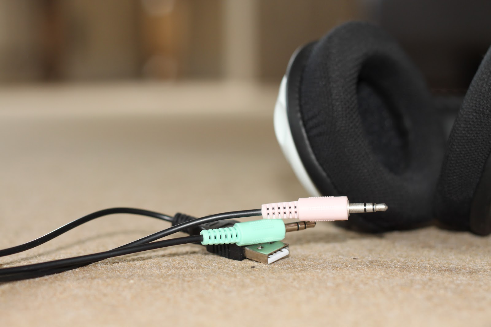
After deciding upon a Paul Renner and Josef Muller Brockmann styled type I went out trying to capture a background image for the poster. My thoughts were to use headphones, jack/USB sockets and old vinyls.


Paul Renner & Josef Muller Brockmann
My next stage of research took me into Paul Renner and Josef Muller Brockmann.


What I liked most about some of the work designed by these two is the simplicity and block colours they used. Also text on an angle is something I really want to use in my design work.


What I liked most about some of the work designed by these two is the simplicity and block colours they used. Also text on an angle is something I really want to use in my design work.
Research
I researched into several designers, mainly pioneers of Swiss typography. I started off with general music posters to try and find some inspiration.


Initial Ideas
After a long and hard process of layouts and various ideas I had several that I put into the MacBook and started to design.


I was really stumped for ideas and it was a slow process. Every idea I tried didn't seem to work, so I went back nearly to the drawing board and started researching again.
Thursday, 2 February 2012
Advertising Campaign
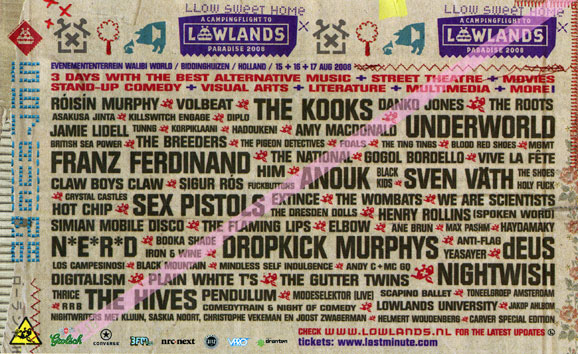
Found an advertising campaign for Saturday Sessions to help me go along the right path with my campaign


Tuesday, 24 January 2012


Thursday, 12 January 2012
Target Audience
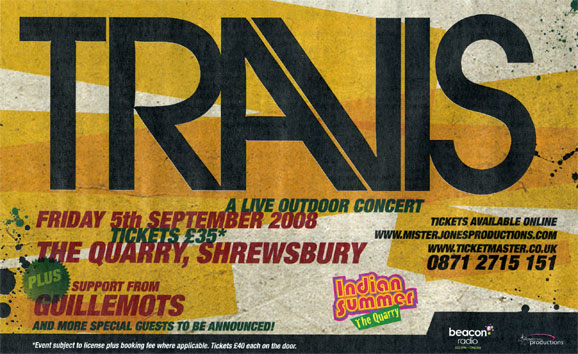
The target audience for the series of A2 posters are dance music lovers with an average age of around 18-30. The venue, Ministry of Sound in London is the most iconic nightclub in the world. Here are some examples of other Ministry of Sound advertising posters.


Colour Swatch & Logo
The colours we have been advised to use are as follows

And the logo we have been given is


And the logo we have been given is
Briefing In
I downloaded the 2012 D&AD Student Awards Competition Briefs just before Christmas, after narrowing them down to just two I have decided on the Ministry of Sound brief.
For this brief I am required to produce a set of three typographically focused A2 outdoor posters. I am really eager to get started on this project as I enjoy poster design. The posters can either be landscape or portrait and act as a three month advertising campaign for the Ministry of Sound's iconic London event 'Saturday Sessions'
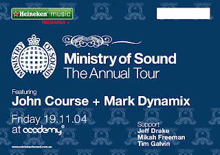
Here is an example of a typographically focused poster for 'Saturday Sessions'

The posters should communicate a clear conceptual theme of idea based on the club or the music, I have been given the Ministry of Sound logo and a colour swatch on the clubs primary advertising colours and so forth. The typography on the posters should strike a balance between expression, experimentation and legibility. Another huge factor I need to think about is that the posters will be often viewed from a moving vehicle so legibility and impact is key.
For this brief I am required to produce a set of three typographically focused A2 outdoor posters. I am really eager to get started on this project as I enjoy poster design. The posters can either be landscape or portrait and act as a three month advertising campaign for the Ministry of Sound's iconic London event 'Saturday Sessions'
Here is an example of a typographically focused poster for 'Saturday Sessions'

The posters should communicate a clear conceptual theme of idea based on the club or the music, I have been given the Ministry of Sound logo and a colour swatch on the clubs primary advertising colours and so forth. The typography on the posters should strike a balance between expression, experimentation and legibility. Another huge factor I need to think about is that the posters will be often viewed from a moving vehicle so legibility and impact is key.
Subscribe to:
Posts (Atom)